
// Creative Agency
Cookie Consent Design: 7 Rules That Work in 2026

Good cookie consent design comes down to one idea: give visitors a clear, equal choice in a small banner that does not block the page, and make sure your site actually honors that choice. In the U.S. that means a banner with balanced Accept and Reject buttons, plain wording, a manage-preferences option, and trackers that stay off until the visitor agrees. The rules below turn that into seven design decisions you can hand to a designer or developer.
If you run a business site, the design question is rarely about decoration. A banner sits on every first visit, on every device, in front of your headline and your call to action. A clumsy one costs you trust. A deceptive one can cost you far more.
TL;DR
- No federal law and no state privacy law requires a cookie banner as such, but if you show one, regulators expect it to work honestly. ConsentStack’s 2026 state review and Legal 500’s December 2025 analysis both say so.
- Make rejecting as easy as accepting: same layer, same size, same style, neutral wording.
- Keep the banner small, reachable on mobile, and placed so it does not shift your layout.
- Group cookies into a few categories, keep non-essential ones off by default, and let people change their mind later.
- Test the banner the way a visitor would: does a “No” really stop the trackers?
Table of Contents
- What a cookie banner has to do in the U.S.
- 7 cookie consent design rules for 2026
- Dark patterns: what to avoid
- Mobile and accessibility checklist
- Where cookie consent fits in the rest of your site
- Our perspective
- Plan your site and its consent experience together
- FAQ
- Sources
What a cookie banner has to do in the U.S.
A cookie consent banner is a message that tells visitors your site uses cookies and asks permission to store or read information on their device. Most offer Accept, Decline and Manage-preferences options, as Ketch describes.
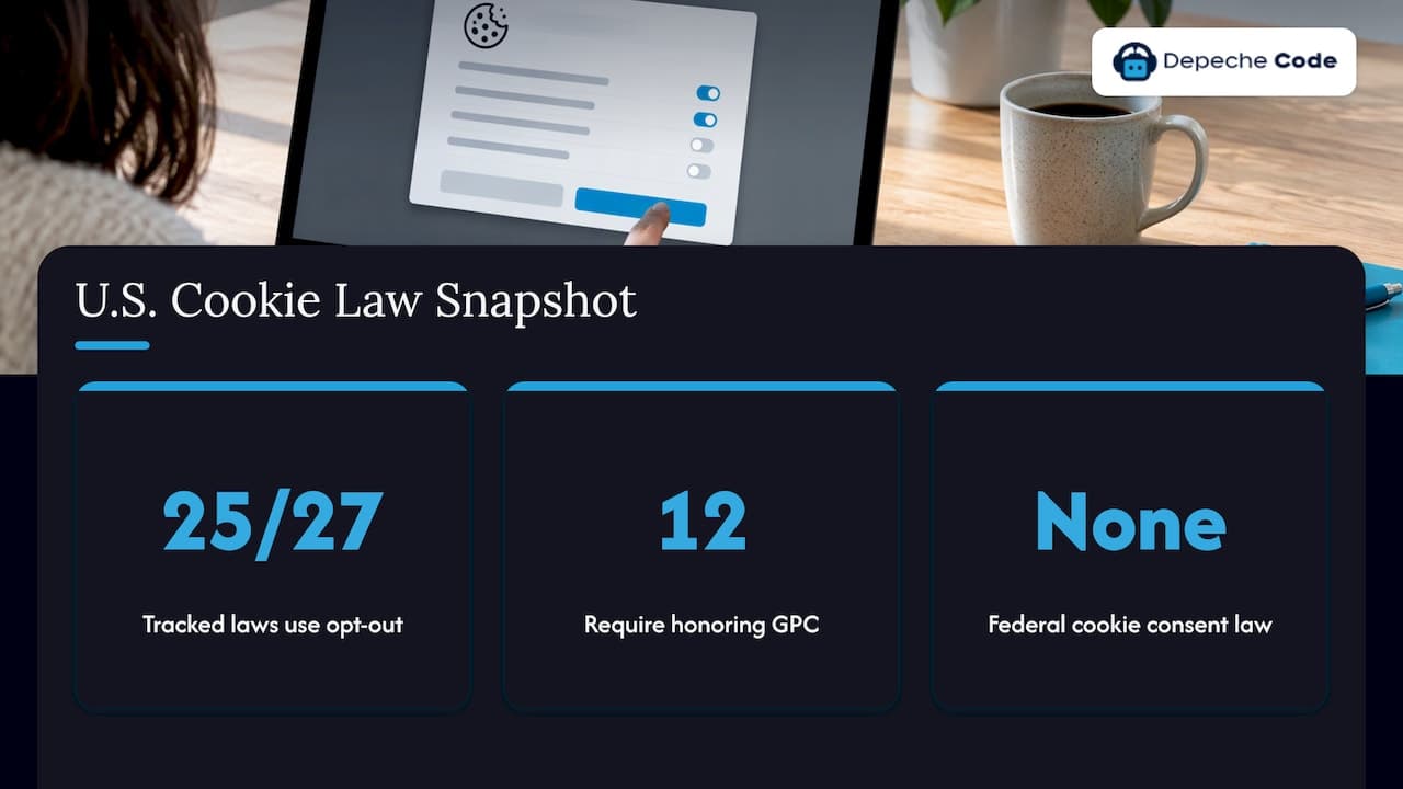
The U.S. is different from Europe here. ConsentStack’s 2026 review found no federal cookie consent law and no state privacy law that requires a banner as such. It also found that 25 of the 27 state laws it tracked run on an opt-out model, and that 12 require honoring Global Privacy Control, a browser signal that tells sites not to sell or share a visitor’s data, automatically.
So why design a banner at all? Because many businesses want visitor consent before loading third-party advertising cookies, to reduce the risk that the use could be treated as a “sale” under California’s law, as a U.S. law firm’s CCPA cookie FAQ explains. And once you offer a banner or preference center, Legal 500 notes, the laws expect real implementation: clear notice of tracking categories and purposes, a meaningful choice, recorded consent, and no non-essential tracking loading until the visitor accepts.
Two caveats shape the design. First, in California a working opt-out needs at least two methods, one being a browser opt-out signal, plus a “Do Not Sell or Share My Personal Information” or alternative opt-out link. ConsentStack adds that California’s rules say a banner alone is not an acceptable way to take an opt-out request. Second, serving visitors from Europe brings stricter expectations, which we cover in our guide to GDPR readiness for U.S. websites. For the legal side in more depth, see our U.S. cookie consent requirements and CCPA compliance checklist for websites. This article stays on design.
7 cookie consent design rules for 2026
1. Give accept and reject equal weight
This is the rule regulators return to most. California’s regulation on consent methods requires “symmetry in choice”: the path to the more privacy-protective option must not be longer or harder than the path to the less protective one. It says outright that a banner offering only “Accept All” plus “More Information” or “Preferences” is not equal or symmetrical.
In practice:
- Put “Accept all” and “Reject all” (or “Only necessary”) on the same layer, side by side.
- Use the same size, font, and similar color weight. France’s regulator CNIL, in its December 2024 formal notice, says the reject link’s color, font size, and style must not be subordinate to the accept option.
- Do not turn “Reject” into a small gray text link while “Accept” is a bright button.
Nielsen Norman Group (NN/g), a UX research firm, recommends clearly marked, low-granularity options: Accept all, Deny all or strictly necessary only, and Manage settings, available immediately rather than hidden.
2. Write neutral, plain wording
The words on the buttons matter as much as the buttons. Germany’s federal justice ministry, in its cookie banner good-practice guidelines, asks for balanced, neutral language that does not make consent look positive and rejection negative. That is a European document, but it is a useful design standard for any site with international visitors.
The New York Attorney General’s website privacy guidance adds a point many sites miss. A pop-up labeled “Accept Cookies” or “Accept All” that implies cookies are only used if clicked is misleading when cookies are actually deployed the moment the visitor arrives. If your wording says one thing and your site does another, the wording is the problem.
The California regulation also bans double negatives and confusing button placement. A toggle labeled “Do not disable analytics: off” is exactly what to avoid.
Here is how the same banner can be written well and badly:
| Element | Weak version | Better version |
|---|---|---|
| Headline | “We value your privacy!” | “Cookies on this site” |
| Body | “We use cookies to give you the best experience.” | “We use cookies for site basics, analytics, and advertising. Choose which to allow.” |
| Primary buttons | “Got it” / “More options” | “Accept all” / “Reject all” |
| Third option | Small gray “Settings” link | Equal-weight “Manage preferences” button |
| Toggle labels | “Disable tracking: off” | “Marketing cookies: off” |
The banner should also say what it is about, the purpose of the consent, and how to give it. That is the standard set by the EDPB Cookie Banner Taskforce report of January 2023, and it is good copywriting advice anywhere.
3. Keep non-essential cookies off by default
No pre-ticked boxes. The German guidelines call for a default of “no consent,” and LogRocket’s cookie UX guide advises keeping all non-essential cookies off until the visitor opts in. Legal 500’s analysis points the same way: courts assessing consent look at clarity, timing, and whether the visitor could proceed without agreeing to non-essential tracking, so gating analytics and advertising behind an accept control sits better with consent principles than firing every tracker at once.
This is a design rule and an engineering rule at once. The toggle’s off state has to mean off in the code, which we come back to in the testing section.
4. Group cookies into a few clear categories
Visitors do not want a list of 60 vendors. LogRocket recommends grouping cookies into categories such as essential, analytics, and marketing rather than dozens of individual options. A simple preferences panel looks like this:
- Strictly necessary: always on, with a one-line explanation.
- Analytics: off by default, one sentence on what is measured.
- Marketing and advertising: off by default, one sentence on who receives the data.
- Preferences or functional: off by default, for things like saved language or settings.
Keep each description to a sentence. Offer a link to the full cookie policy for readers who want the detail. Ketch lists a link to adjust preferences, information on why the site needs cookies, and a cookie policy among the elements of a compliant banner.
5. Make it small, visible, and out of the way
NN/g’s research found that participants preferred small overlays that did not block page content, and found large overlays intrusive and annoying. Options that are immediately available are especially helpful on mobile, where screen space is tight.
Two design choices follow:
- Placement: Google’s web.dev guidance says footer placement is generally preferable to header placement because it is unobtrusive, does not compete with banner ads, and typically does not cause layout shift. See web.dev’s cookie notice best practices.
- Layout stability: reserve space for the notice in the page, or use a sticky footer or modal, so the page does not jump when the banner loads. Layout shift hurts both the visitor’s experience and your Core Web Vitals scores.
Do not build a full-screen wall that must be dismissed before anyone can read anything. The EDPB taskforce says banners should not give users the impression they must consent to access content, and should allow navigation without cookies from the first level.
6. Let people change their mind
Consent is not a one-time event. LogRocket advises always letting users change preferences or withdraw consent later. The easiest pattern is a small persistent link in the footer, such as “Cookie settings,” that reopens the banner. Some page builders do this with an anchor link that relaunches the banner, as Unbounce documents.
If you are subject to California’s rules, also add the opt-out link described earlier. A banner and a footer link serve different jobs, and the footer link is the one that is always there.
7. Make sure a “No” actually works
The most expensive design flaw is invisible: a banner that looks right but does not control anything. The New York Attorney General’s office observed that an interface that seems to honor a visitor’s choices but does not can be misleading. In one case it cited, even the AG’s own reviewers initially missed a required “Save Settings” step that was faded and hard to find.
So test like a visitor:
- Open the site in a private window and decline everything.
- Check in your browser’s developer tools that analytics and advertising scripts and cookies did not load.
- Accept, then confirm they do load.
- Reopen the settings, withdraw consent, and confirm they stop.
- If you honor Global Privacy Control, turn the signal on in a supporting browser and confirm trackers stay off.
Repeat after every site update, theme change, or new marketing pixel. Consent tools usually need to load before other scripts, so a new tag dropped in above them can quietly break the setup.
Dark patterns: what to avoid
California’s regulations define a dark pattern as a user interface that substantially subverts or impairs user autonomy, decision-making, or choice. Agreement obtained that way does not count as consent. The patterns to cut from any design:
- A bright Accept button next to a faded or buried Reject option.
- Reject hidden two clicks deep, behind “More options.”
- Pre-ticked category toggles.
- Confirmation shaming, such as “No, I don’t want a better experience.”
- Double negatives and unclear toggle labels.
- A required extra “Save” step that looks optional or is hard to spot.
NN/g researcher Samhita Tankala makes the business case against going the other way too: giving no cookie options at all can be as risky as having users opt out, since sites lose trust and visitors may leave or clear their cookies right after using the site. Clear choices are good design, not just compliance.
Mobile and accessibility checklist
Most first visits happen on a phone, so check the banner there first.
- Buttons large enough to tap without zooming, with space between them so a visitor does not hit the wrong one.
- Banner height kept to a small share of the screen, so the headline and main content stay visible.
- Text that wraps cleanly and stays readable at larger system font sizes.
- Sufficient contrast for button labels and toggle states, with the on and off states distinguishable by more than color.
- Keyboard and screen reader access: the banner should be reachable in a logical tab order, and focus should return to the page after a choice.
- No layout jump when the banner loads or disappears.
A banner that blocks the form your sales team depends on is also a conversion problem. Our guide to lead form best practices covers how small layout details affect results, and the same thinking applies here.
Where cookie consent fits in the rest of your site
A banner is not a separate project. It shares screen space with your navigation, your hero section, your chat widget, and your forms. Redesigning a site without planning for it leads to overlap, shifted layouts, and conflicting pop-ups. If you are planning a redesign, build the consent experience into the plan from the start, and see our dos and don’ts of redesigning your website for better UX. Our small business website essentials list covers the other pages and elements that sit alongside it.
If you also run an AI chat widget that collects visitor messages, its privacy notice needs the same care. We cover that in our guide to a chatbot privacy policy.
Our perspective
We think of cookie consent as part of website design, not a plugin dropped on top of it. Every banner we see done badly has the same root: nobody decided where it lives, what it says, and what it controls until the day before launch.
Our view is simple. The design brief should state the layout, the wording, the button hierarchy, and the test plan together. A banner that is symmetrical, small, and truthful is easier to read, and it keeps your page fast and stable, which we measure through Google PageSpeed and SEO scores.
Because we build and redesign websites and maintain WordPress sites, we treat the places a banner touches, your layout, your scripts, and your updates, as one system. When a site changes, the consent experience should be checked with it.
Donovan Wells - Founder and CEO
Plan your site and its consent experience together
If you are building a new site or redesigning an existing one, the banner, the preference link, and the pages behind them should be designed with everything else. We offer website design and redesign, plus WordPress hosting and maintenance, for businesses that want a site managed by one team. WordPress maintenance plans start from $99 per month, and dedicated WordPress hosting from $39 per month.
To discuss your site, start at depechecode.io.
FAQ
Does my U.S. website legally need a cookie banner?
Not as such. ConsentStack’s 2026 review found no federal cookie consent law and no state privacy law that requires a banner by name. But state laws, especially California’s, impose duties on selling or sharing personal data, and a banner you do show must be honest and functional. Talk to a privacy attorney about your specific situation.
What should a cookie banner say?
It should say what the cookies are for, name the categories (such as essential, analytics, and marketing), and offer Accept, Reject, and Manage options with a link to your cookie policy. Keep the language plain and neutral. Avoid wording that makes accepting sound good and rejecting sound bad.
Does GDPR apply to a U.S. site’s cookies?
It can, when your site serves visitors in the European Union. European regulators expect equal accept and reject options and no pre-ticked boxes, as the EDPB and CNIL material above shows. If you have European traffic, see our GDPR guide for U.S. websites and ask a privacy lawyer about your exposure.
Where should the banner go on the page?
A small banner in the footer area is generally the best choice. Google’s web.dev guidance says footer placement is unobtrusive and typically avoids layout shift, while a large overlay that covers the content irritates visitors, according to NN/g’s research.
How do I let visitors change their consent later?
Add a permanent “Cookie settings” link in the footer that reopens the banner or preference panel. If California law applies to you, also provide the required opt-out link and honor browser opt-out signals.
Sources
- Cookie consent banner: Is your website fully compliant? (Ketch)
- Cookie Banner Requirements for GDPR, CCPA (Ketch)
- Answers to the most frequently asked questions concerning cookies (CCPA)
- Cookie Permissions 101 (Nielsen Norman Group)
- Cookie UX: How to ask users for their cookies (LogRocket)
- EDPB Cookie Banner Taskforce report, January 2023
- Cookie notice best practices (web.dev)
- Cal. Code Regs. Tit. 11, § 7004
- Website Privacy Controls (New York Attorney General)
- CNIL formal notice on dark patterns in cookie banners
- U.S. Website Compliance For Cookies And Tracking Technologies (Legal 500)
- Are Cookie Banners Required in the US? 2026 state-by-state (ConsentStack)
- Adding a Cookie Banner to Unbounce (documentation)